While the fill-in choice field, either single or multi-select, works beautifully in the SharePoint Online UI, Power Apps is late to the party. Out of the box, PowerApps does not come with a combo box property to allow for fill-in, (i.e., custom), choices to be added and saved to SharePoint upon submitting the connected SharePoint Form. However, overcoming this limitation is quite easy with a few key adjustments. This post will detail a solution for patching a multi-selection, fill-in SharePoint Choice field using the Power Apps Form control connected to a SharePoint List.
SharePoint Structure
Let’s begin by reviewing the structure of our example SharePoint List. I will be using a list called Team Members. The main field we are focusing on is a field called Favorite Color (internal SharePoint name: FavoriteColor), which is a multi-selection enabled, fill-in enabled Choice field.
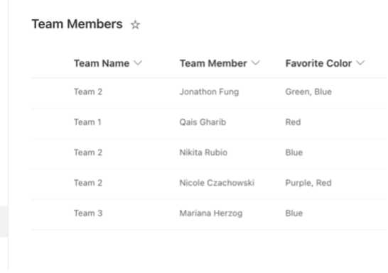
Team Members SharePoint List
A closer look at the specifications of Favorite Color can be found below. Note that the default choices are Red, Green, Purple, and Blue.
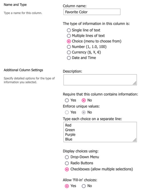
Favorite Color specifications
Power App Solution
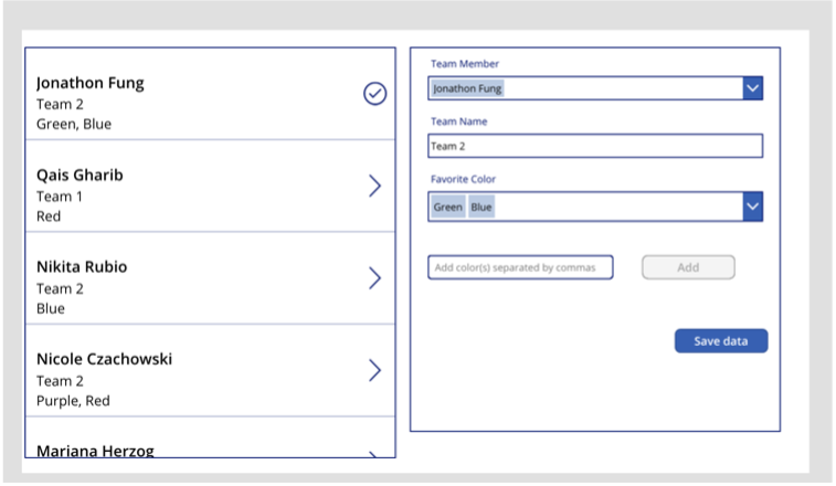
Our Power App is very simple: We have a gallery control populated by the Team Members SharePoint List, and a SharePoint Edit Form control connected to the Team Members SharePoint List.
Our solution starts at the app’s OnStart property.
OnStart code:
In Step 1, we are simply refreshing the Team Members SharePoint List to keep it up to date as we interact with the app.
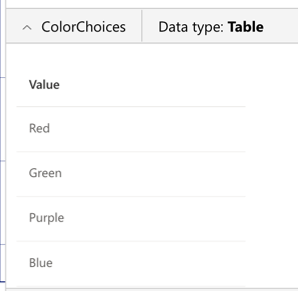
In Step 2, we are collecting the default choices for the FavoriteColor field, which are Red, Green, Purple, and Blue, into the ColorChoices collection.
In Step 3, we loop through each color that has been saved in the Favorite Color field, in every line item of the Team Members SharePoint List, and add it to the ColorChoices collection if it is not already stored in it. This captures not only the default color choices (Red, Green, Purple, and Blue) into the ColorChoices collection, but any fill-in colors that may have been inputted by a team member in the Team Members SharePoint List. If there are not any fill-in colors being used anywhere in the SharePoint List at the time of the app’s opening, then ColorChoices is simply made up of Red, Green, Purple, and Blue until further actions are made.
In this demonstration, we are beginning with our Team Members SharePoint List being populated like this:

Since only default Favorite Color choices are being used in the list, the ColorChoices collection is populated like so upon opening the app:
Next, we move on to the OnSelect code of the check badge / right chevron icon of our gallery control.
Gallery icon OnSelect code:
In Step 1, we are saving the selected line item’s ID field in the locID context variable, which will be used to populate our Form control.
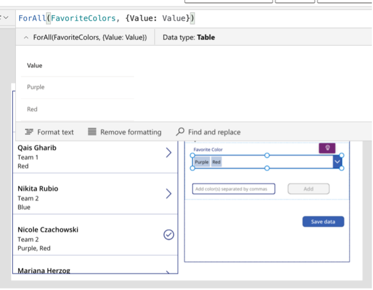
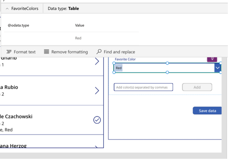
In Step 2, we are creating our second collection, FavoriteColors, and populating it with the selected team member’s selections in the FavoriteColor SharePoint field.
Let’s consider my line item in Team Members, which is currently populated like this: 
When my row is selected in the gallery control, the FavoriteColors collection will be populated like so:

Let’s move on to our Form control.
The Items property of the form control is populated with the following code:
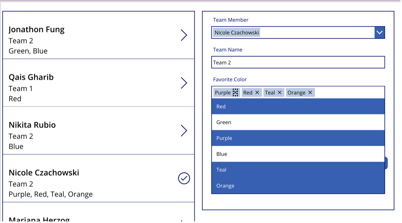
After clicking on my row in the gallery, the Form control is then populated like so by its Items property:
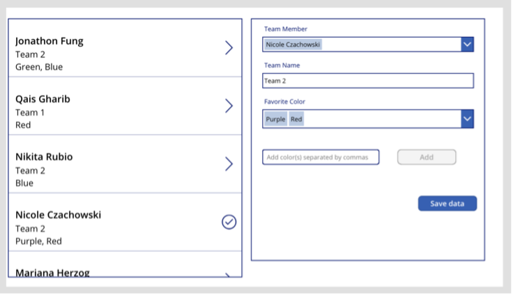
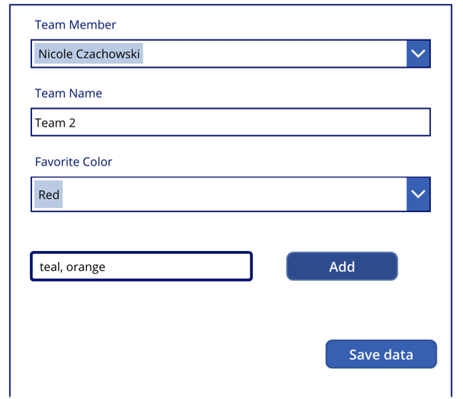
There are 4 data cards in our Form: Team Member, Team Name, Favorite Color, and a custom data card called "Submit" that holds our "Save data" button. We will focus mostly on the controls within the Favorite Color datacard.
Within the Favorite Color datacard, we have a Favorite Color combobox (combobox_FavoriteColor), a Favorite Color text input to input fill-in color choices (textinput_FavoriteColor), and an Add button to save fill-in color choices to the Favorite Color combobox's selected items.
The DefaultSelectedItems property code of the Favorite Color combobox is:
DefaultSelectedItems property code: ForAll(FavoriteColors, )
This allows each line item in the Value column of the FavoriteColors collection to appear as a separate selected item in the Favorite Color combobox.
The Items property code of the Favorite Color combobox is:
Items property code:
ColorChoices
We'll now move into the Add button's OnSelect property code:
This code allows users to input either a single fill-in color or a comma-delimited list of fill-in colors into the Favorite Color text input, then adds the color(s) to the FavoriteColors collection, which populates the Favorite Color combobox. The Proper() and TrimEnds() functions are used to avoid unnecessary duplications of fill-in color values.
The OnChange property code of the Favorite Color combobox is:
In Step 1 of this code, the FavoriteColors collection is cleared and re-populated with the selected items of the Favorite Color combobox.
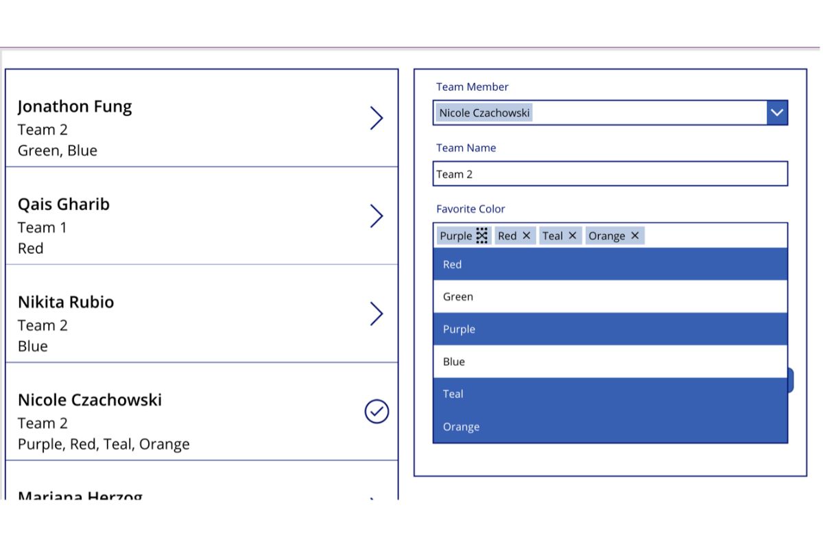
In Step 2, the code loops through each of the Favorite Color combobox’s selected items and removes it from the FavoriteColors collection if it does not exist in the FavoriteColors collection, but is one of the combobox’s selected items. This code adds functionality to the selection of the “x” next to a selected item in the combobox, pictured below:
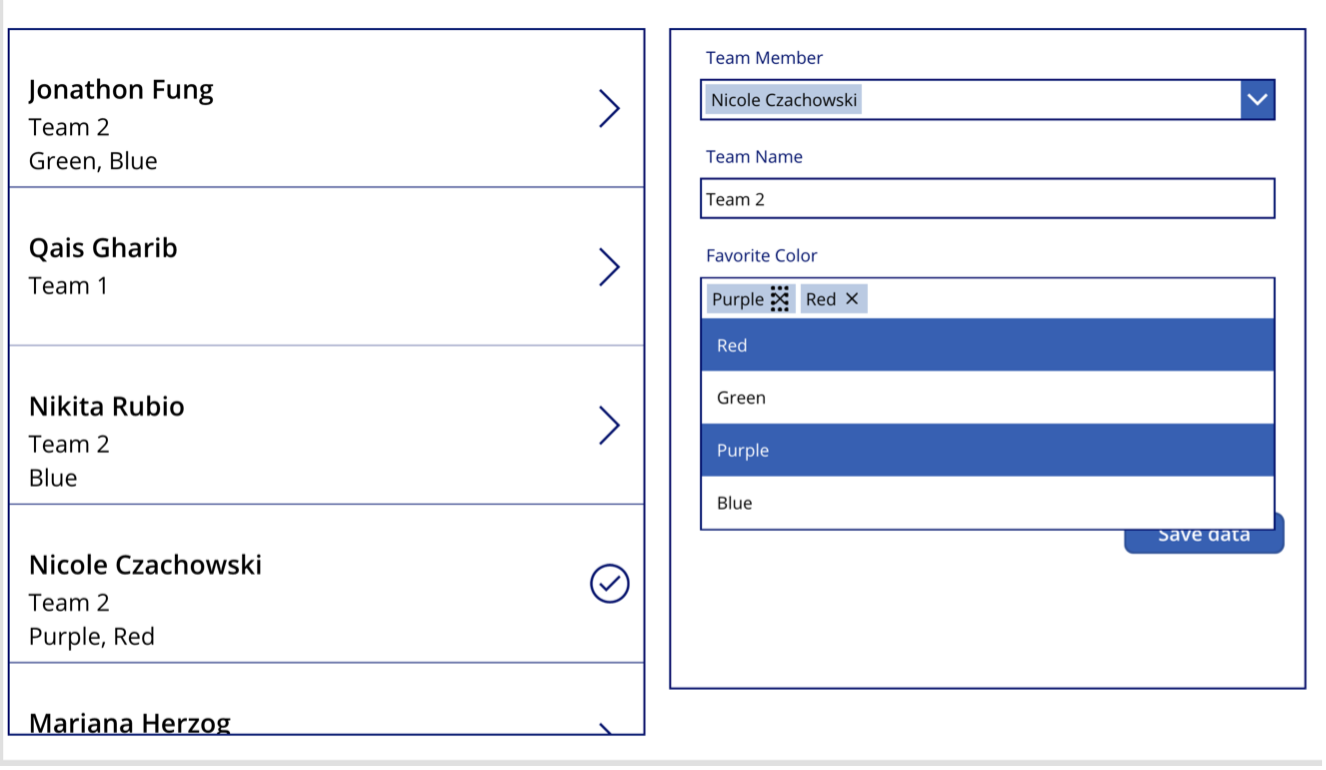
When the Purple selected item’s “x” icon is selected, the OnChange code is triggered. Since “Purple” was removed from the combobox’s selected items by selecting the “x”, it is then removed from the FavoriteColors collection, which populates the combobox. Thus, “Purple” is no longer displayed in the combobox.
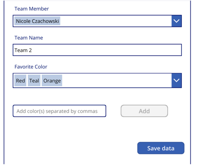
The Favorite Color combobox’s OnChange property and the Add button’s OnSelect property work in-conjunction to handle the addition of new fill-in colors. When a new fill-in color is added by typing its name into the Favorite Color text input and selecting the Add button, it is displayed in the combobox as pictured below:
The Save data button’s OnSelect property code is below:
In Step 1, the SubmitForm() function is used to save the Form’s values to the SharePoint List.
In Step 2, a section of the OnStart property’s code is used to update the contents of the ColorChoices collection. If any fill-in color choices were just saved to the SharePoint List in the earlier SubmitForm(), they will be added to the ColorChoices collection, which populates the choices of the Favorite Color combobox. In this way, since I inputted the fill-in colors of teal and orange, other users will be able to view those colors right along with the default color choices in the dropdown items of the combobox.
In Step 3, we simply refresh the SharePoint List to ensure that the gallery visually syncs our changes.
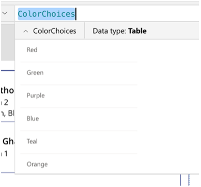
After saving my favorite colors to be red, teal, and orange, our ColorChoices collection is populated like this:
And the corresponding Favorite Color dropdown choices are now populated as pictured below:
Conclusion
When working with Power Apps, sometimes it is necessary to push beyond out-of-the-box features to implement the functionality you want. With this creative solution, patching a multi-select, fill-in SharePoint Choice field with a Form control is a breeze!
If you are new to the low-code/pro-code approach using the Power Platform and would like assistance, reach out at any time to discuss Compass365’s Power Platform Consulting Services We are happy to help. Contact us to arrange for a complimentary consultation.
Compass365, a Microsoft Gold Partner, delivers SharePoint, Microsoft Teams, and Power Platform solutions that help IT and Business leaders improve the way their organizations operate and how their employees work.