
Creating a visually appealing and user-friendly interface is paramount when designing Power Apps. A common challenge many Power Apps developers face is managing screen real estate. When screen real estate is not optimized, screens can easily appear cramped and overloaded with controls, leading to poor user experiences and inefficiency. With limited space and a wealth of information to display, developers must ensure that their apps are not only functional, but aesthetically pleasing and uncrowded to the eye.
Enter Power Apps’ key design controls: Containers, Vertical Containers, and Horizontal Containers. These controls are designed to help you optimize screen space and organize app content beautifully and efficiently. Let’s explore how to leverage these controls to make the most of your screen real estate and craft a stunning UI.
Power Apps Containers
Containers in Power Apps are versatile components that help you group and manage other controls. By using Containers, you can ensure that your app’s layout is both responsive and aesthetically pleasing. Containers can automatically adjust their size based on their content, making it easier to maintain a consistent and clean look.
How to Use Containers:
- Group Related Controls: Use Containers to group related controls together. This helps in maintaining a structured layout and makes it easier to manage the visibility and alignment of related elements.
- Manage Layout Responsively: Containers can help in creating responsive designs that adjust to different screen sizes and orientations. By grouping elements within Containers, you can ensure that they scale and reposition correctly when the screen size changes.
Vertical Containers
Vertical Containers are designed to stack elements vertically, one after the other. They are ideal for content that flows in a top-to-bottom arrangement.
Horizontal Containers
Horizontal Containers allow you to arrange controls side-by-side, making them perfect for creating layouts where elements need to be displayed in a left-to-right fashion.
Tips for Using Containers:
- Use Padding and Gap Properties: Ensure there is enough padding between elements to avoid a cluttered look. Proper spacing enhances readability and user experience.
- Utilize Scrollbars: Allow for overflow of data by displaying scrollbars.
- Combine with Other Controls: Containers can be used in conjunction with other controls like Galleries to present information in a structured way.
- Combine with Other Containers: For the most effective use of screen real estate, consider nesting various types of containers. This allows you to create complex, visually appealing layouts.
Case Study: Use A Horizontal Container to add horizontal scrollbars to a Vertical Gallery
Adding a vertical scrollbar to a Vertical Gallery is as easy as toggling “Show scrollbar” to true. However, there is no out-of-the-box way to add a horizontal scrollbar to a Vertical Gallery. Adding a horizontal scrollbar to a Vertical Gallery is useful when there is a surplus of side-by-side data to display in the Gallery, but there is not enough screen real estate to allow the Gallery’s Width to support the amount of data it needs to contain. This solution not only allows for maximum data inclusion in the Gallery, but also improves the readability of the screen by allowing for more room for extra spacing and padding.
Let’s explore a deep dive of this solution, starting with a video of the solution in action followed by the specifications of the controls.
Let’s take a closer look at the Tree View to inspect the controls, then review the most important properties of the controls.
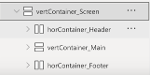
Nest two Horizontal Containers, one containing the header and one containing the footer, and a Vertical Container inside the main screen Vertical Container (vertContainer_Screen).
- vertContainer_Screen Properties
- Set the Width to “Parent.Width” and the Height to “Parent.Height”
- Set the Gap property to 15
- Set all Padding properties to 15
- Set Drop Shadow to Light
- horContainer_Header Properties
- Set the Gap property to 0
- Set the Height to 50
- Turn off Flexible Height
- Set all Padding properties to 0
- Set Drop Shadow to Light
- vertContainer_Main Properties
- Set the Gap property to 15
- Turn on Flexible Height
- Set all Padding properties to 15
- Set Drop Shadow to Light
- horContainer_Footer Properties
- Set the Gap property to 0
- Set the Height to 50
- Turn off Flexible Height
- Set all Padding properties to 0
- Set Drop Shadow to Light
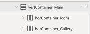
Within the Vertical Container that represents the space in between the header and footer (vertContainer_Main), insert two additional Horizontal Containers, one to contain the icons and one to contain the Gallery.
- horContainer_Icons Properties
- Set the Gap property to 0
- Set the Height to 50
- Turn off Flexible Height
- Set PaddingLeft and PaddingRight to 15 and PaddingTop and PaddingBottom to 0
- Set Drop Shadow to Light
- horContainer_Gallery Properties
- Set the Gap property to 0
- Set the Height to 200
- Set the Width to Width-(Self.X*2)
- Turn off Flexible Height
- Set all Padding properties to 0
- Set Drop Shadow to Light
- Set Horizontal Overflow to Scroll
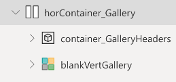
Within the Horizontal Container that contains the Gallery (horContainer_Gallery), insert one Container control to store the Gallery headers as text labels, and insert one Blank Vertical Gallery.
- container_GalleryHeaders Properties
- Set all Padding Properties to 0
- Set the Height to 50
- Turn on Flexible Width
- Set the LayoutMinWidth to LayoutMinWidth
- blankVertGallery Properties
- Set Template Padding to 15
- Turn on Flexible Width
- Set LayoutMinWidth to 1800
- Because the LayoutMinWidth value of blankVertGallery and container_GalleryHeaders (1800) is greater than horContainer_Gallery’s Width (Formula: Width-(Self.X*2); Value: 1306), horContainer_Gallery’s horizontal scrollbar becomes visible, allowing for horizontal scrolling across blankVertGallery
Don’t Let Any Space Go to Waste with Power Apps Containers!
Managing screen real estate in Power Apps doesn’t have to be a daunting task. By leveraging Containers, Vertical Containers, and Horizontal Containers, you can design applications that are both functional and visually pleasing. These tools enable you to group and arrange your controls in a way that maximizes screen space and enhances user experience.
Take the time to experiment with these controls and discover how they can transform your app’s layout. With thoughtful design and strategic use of Containers, you can create powerful, efficient, and beautiful Power Apps that make the most out of every pixel on your screen.
If your organization is new to Power Apps Development or looking to expand your delivery capacity in this exciting automation space, Compass365 can help. Please contact us to arrange for a complimentary consultation.
Compass365, a Microsoft Gold Partner, delivers SharePoint, Microsoft Teams and Power Platform solutions that help IT and Business leaders improve the way their organizations operate and how their employees work.