The Fluent Details List component in the Creator Kit is the next best thing since the classic Power Apps Gallery. Using the Details List can give your apps a sleek, compact look and unlock new opportunities for customization and functionality. If you need to display and interact with a large volume of information in a relatively small space, the Details List should be your first pick. At first, using the Details List might seem a little daunting compared to Galleries so I’m going to break down a small, basic set of properties that can make your very first Details List come to life.
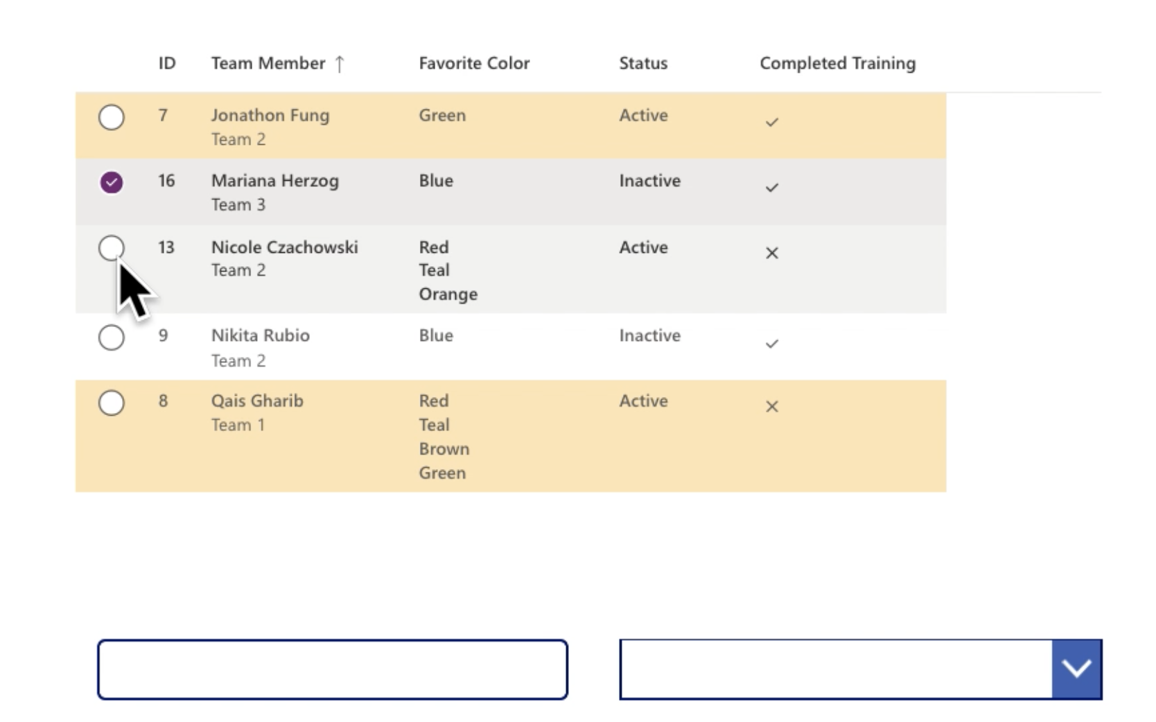
Example Details List
Let's take a closer look at the code that makes up this Details List.
Columns_Items Property
In this property, we are going to specify the properties of each field we want to display in the Details List. For the full list of properties available, see Microsoft's documentation on the Details List.
Columns_Items Property Code:
Table(
,
,
,
,
,
)
In this property, we can customize how each field is displayed in the Details List. We need to include every field that we want to be displayed in the Details List in this property. Using the Table function is the recommended way to achieve this. Below is a quick summary of the properties used in our code:
- ColName: The SharePoint internal name of the column, OR the renamed column from an AddColumns function in the Items Property of the Details List
- ColDisplayName: The column name that will be actually displayed in the Details List
- ColWidth: The width of the column
- ColSortable: Whether the column is able to be sorted or not
- ColIsBold: Whether the column display name appears as bold or not
- ColResizable: Whether the column can be clicked-and-dragged to a greater width. This is a great way to save space in your apps but still display columns with lots of text
- ColCellType: Specifies non-default cell types. Options include expand, tag, indicatortag, image, clickableimage, and link.
- ColShowAsSubTextOf: This property will make the column a child of the specified column. It will appear in smaller text underneath the specified column.
Items Property
In our Items Property, we will not only connect to our data source, but also apply a ComboBox filter with the Filter function, search using a Text Input with the Search function, and sort by any column with the SortByColumns function.
Items Property Code:
Search(SortByColumns(Filter(AddColumns(‘Team Members’,
“strTeamMember”, ThisRecord.’Team Member’.DisplayName,
“strFavoriteColor”, ThisRecord.’Favorite Color’.Value,
“strStatus”, ThisRecord.Status.Value,
“boolCompletedTraining”,
If(
ThisRecord.’Completed Training’,
“icon:StatusCircleCheckmark”,”icon:StatusCircleErrorX”
),
“RecordKey”, Text(ThisRecord.ID)),
Or(
strStatus in (cbColor.SelectedItems).Value,
IsEmpty(cbColor.SelectedItems),
IsBlankOrError(cbColor.Selected)
)),
sortCol, If(sortAsc, SortOrder.Ascending, SortOrder.Descending)), txtSearch.Text, “strTeamMember”)
The below image sections off the code of the Items Property into easier-to-understand pieces:

AddColumns Section:
- When using the Details List component, complex data types need to be converted using the AddColumns function.
- In my datasource, the fields Team Member, Favorite Color, and Status are SharePoint Choice columns. The field Completed Training is a SharePoint Yes/No (boolean) column. I used the AddColumns function to convert these fields into acceptable data types for the Details List component’s Items Property.
- I have converted Team Member, Favorite Color, and Status into strings and Completed Training into an image. The Details List connects directly to Fluent UI icons, so I can easily specify what image I would like to display by using “icon:iconname”.
- Don’t forget that these added columns need to be referenced in the Columns_Items Property, as shown earlier in this article.
- RecordKey is a built-in property of the Details List component. Add this field to your Details List to reference your data source’s primary key – in this case, the primary key is ThisRecord.ID
Filter Section:
- I am filtering the strStatus field (specified in the AddColumns function) by the cbStatus ComboBox, allowing for a blank ComboBox selection to return all rows in the Details List, or a populated ComboBox selection to return all rows in the Details List with strStatus = the selected value of the ComboBox
Sort Section:
- I am sorting by a context variable, sortCol, which will store the name of the selected column to be sorted. This enables the user to sort by any of the sortable columns. The user can simply click from column to column to begin sorting. If a column is double-clicked, the sort will change from ascending order to descending order
- I use another context variable, sortAsc, to determine whether the sort direction is ascending or descending
Search Section:
- I am searching the strTeamMember field using the txtSearch Text Input
Add Fields to the Details List
Next, we must add all the fields that we want to show in the Details List using the Fields property in the Controls Pane. Remember, since we used the AddColumns formula in the Items property to convert a few of our fields to the appropriate data types, we must select the added columns that correspond to these fields (e.g., strTeamMember) from the fields list and not the original field names (e.g., Team Member).

OnChange Property
In the OnChange Property, we must define our context variables sortCol and sortAsc when the action being taken on the Details List is "Sort". sortCol is defined as the "SortEventColumn", aka the column that is currently being sorted by. sortAsc is defined as either ascending or descending.
OnChange Property Code:
If(Self.EventName="Sort",
UpdateContext()
);
CurrentSortColumn Property
In this property, we need to specify the name of the column we want to sort by. In our case, we are using a context variable called sortCol, which enables us to dynamically select which column we would like to sort by.
CurrentSortColumn Property Code:
sortCol
CurrentSortDirection Property
In this property, we need to specify what our context variable sortAsc means in terms of the CurrentSortDirection (either ascending or descending) of the selected column.
CurrentSortDirection Property Code:
If(sortAsc, 'PowerCAT.FluentDetailsList.CurrentSortDirection'.Ascending, 'PowerCAT.FluentDetailsList.CurrentSortDirection'.Descending)
SelectionAlwaysVisible Property
This property should be true if the left-hand selection radio buttons should always be visible, and not just when the row is hovered over.
SelectionAlwaysVisible Property Code:
true
SelectionType Property
This property specifies how many rows can be selected at a time. The options are: None ("0") – no rows can be selected, Single ("1") – one row can be selected at a time, or Multiple ("2") – multiple rows can be selected at a time.
SelectionType Property Code:
"1"
AlternateRowColor Property
If a HEX text value is specified in this property, the Details List will use that color to implement alternate row coloring.
AlternateRowColor Property Code:
"#FFE5B4"
The Details List: A Gallery with a Makeover!
The Details List component stands out with its beautiful design and smooth functionality. If you are looking to level up your Power Apps, try out the Details List from the Creator Kit today!
If you are new to the Power Platform or looking to expand your capacity in this exciting automation space, Compass365 can help. Explore our Power Platform Services or contact us to arrange for a complimentary consultation.
Compass365, a Microsoft Gold Partner, delivers SharePoint, Microsoft Teams and Power Platform solutions that help IT and Business leaders improve the way their organizations operate and how their employees work.